Plain text email formatting that looks great on mobile
Plain text email formatting that reads well on mobile: bullets, spacing, proof blocks, and quick checks to keep cold emails clear and credible.
Why plain text formatting matters on mobile
Most cold emails get read on a phone. Plain text email formatting can make your message feel clear and personal, or messy and hard to trust.
On a small screen, long lines wrap in weird places, paragraphs turn into gray blocks, and key details disappear. When someone has to work to understand your email, they usually do the simplest thing: swipe away.
Formatting isn't decoration. It's a signal. Clean spacing makes your email feel calm and real. A cramped wall of text looks like a mass template. That first impression affects whether the reader trusts you and whether replying feels quick.
On mobile, people scan before they read. They look for:
- who you are and why you're emailing them
- the one specific problem you solve
- proof you've done this before
- the ask (and how easy it is to respond)
If those parts are easy to spot, your email feels low-risk. If they're buried in a dense paragraph, the reader has to hunt for the point, and replies drop.
A simple example: compare "I wanted to reach out because..." plus 10 lines of text versus 2 short sentences, a single proof line, and a one-line question. The second feels like it takes 10 seconds to handle.
The goal isn't to be fancy. It's to be clear, credible, and easy to reply to, even with one thumb.
The mobile reading rules (simple and practical)
Most people open cold emails in a hurry, with notifications popping up. If your message looks dense, it gets skipped even if the offer is good.
Aim for this: easy to scan in 5 seconds, easy to read in 20.
Keep paragraphs short. On mobile, long sentences wrap into tall blocks and the reader loses the thread. One idea per paragraph helps someone pause and come back without rereading.
Rules that work across most inbox apps:
- Keep paragraphs to 1-2 sentences.
- Put the main point in the first 2-3 lines.
- Use simple punctuation (-, :, parentheses) instead of fancy symbols.
- Keep the whole email to a few screens. If it scrolls forever, it loses.
Plain text also means avoiding anything that looks like an ad: lots of exclamation points, ALL CAPS, heavy separators, or hypey language.
When you edit, do one pass just for mobile. Read top to bottom and remove anything that isn't needed to understand the offer. If a sentence doesn't move the reader toward a quick decision, cut it or split it.
A plain text layout that works in most inboxes
Mobile readers decide fast. If the first two lines don't say why you wrote, they scroll past.
A simple structure that fits most cold emails:
- Context opener (1-2 short lines)
- Proof (1 tight line, ideally with a number or recognizable category)
- One question
- One clear CTA (yes/no or a simple next step)
In plain text email formatting, you can make key details stand out just by putting them on their own line. Names, numbers, timeframes, and outcomes shouldn't be buried inside a long paragraph.
Here is a layout you can copy and reuse:
Subject: quick question about [specific thing]

Hi [First name] - quick note.

I noticed [relevant observation about their role/company].

Proof: we helped [similar company/type] get [result] in [time].

Would it be useful if I shared the 3 steps we used?

If yes, should I send it here, or is there someone else I should talk to?

-[Your name]
Small readability habits that help on mobile:
- Keep paragraphs to 1-2 sentences.
- Put numbers on their own line when they matter.
- Use one blank line between ideas.
If you want this to be consistent across a team, keep one approved template and only swap the opener and proof line. If you're running sequences, LeadTrain (leadtrain.app) is designed to keep plain text structure consistent across multi-step sends, while handling the unglamorous setup work like domains, authentication, warm-up, and reply sorting.
Bullet patterns that stay readable everywhere
Bullets make a mobile reader pause and scan, but only when they're short.
Use bullets when a few options or benefits would feel messy in a sentence. Skip bullets when the list is long or needs explanation. On a phone, five lines of bullets can feel like homework.
For plain text email formatting, the safest bullet symbols are simple ones that render well everywhere. Hyphens and asterisks are hard to break across clients.
Keep bullet lists tight:
- 3 bullets max
- 3-8 words per bullet
- Same structure in each bullet (all verbs or all noun phrases)
A few style choices that improve scanning:
- Prefer one line per bullet.
- Avoid commas inside bullets.
- Use no ending punctuation, or use it for every bullet.
If you need detail, put it after the list as one sentence. That keeps the bullets scan-friendly but still gives enough context to reply.
Spacing and separators that feel human, not spammy
Good spacing is the easiest way to make a cold email feel calm on a phone. In plain text, a single blank line is your best tool.
If a paragraph runs longer than 3-4 lines on mobile, split it. Walls of text look like work.
A simple pattern that usually reads well:
- 1-2 lines: why you're reaching out
- 1-2 lines: proof
- 1 line: question or CTA
- 1 line: close
Separators can help when you have details, but keep them normal. A blank line works. A single "---" once is fine. Avoid heavy blocks of symbols like "=====" or "*****".
For proof, small and factual beats dramatic. A labeled mini-block scans well in plain text:
Role: SDR team lead Result: 18% reply rate in 14 days Time: 2 hours to set up
That's enough. You're giving evidence without asking the reader to decode a story.
How to highlight proof without HTML
Proof works best in plain text when it's small, specific, and placed right before the ask. Think of it as a quick reason to believe, not a paragraph that tries to close the deal.
A placement that reads well on mobile:
Opener -> problem -> proof (1-2 lines) -> ask
That way, proof supports the request instead of feeling like bragging.
Proof that fits in plain text
The easiest proof to scan is the kind that lands in one glance:
- A metric with context: “Reduced no-shows from 18% to 11% in 30 days.”
- A name or category (only if appropriate): “Used by 3 boutique agencies in NYC.”
- A mini case note: “We tweaked the first 2 emails and replies picked up in week 2.”
- A credible constraint: “Small sample (12 accounts), but the pattern was consistent.”
Then go straight into the ask. For example:
“Worth a 10-minute call next week to see if this could work for you too?”
4 proof formats you can copy
A micro-story often sounds more human than a raw number:
“Before: outbound was inconsistent. After: a simple 4-step sequence, and they booked 6 meetings last month.”
A short metric also works:
“Avg. reply rate: 8-12% across the last 5 campaigns.”
If you need multiple points, keep it to two lines and stop.
To avoid sounding inflated, skip vague wins like “huge results” or “massive growth.” Use a real range, add a timeframe, and avoid stacking claims. If the proof isn't strong, be direct: “No case study yet, but I can share the exact message we’re testing.”
Step-by-step: format a plain text email in 10 minutes
Start with the ugly version. Write the email the way you'd type it in chat. No bullets, no spacing tricks, no "formatting voice." You need the raw message first.
Then cut and reorder for how people scan on a phone. Put the "why you" line first, then proof, then the ask. If a sentence doesn't help the reader decide "yes" or "maybe" in 10 seconds, delete it.
Use spacing to create three blocks: opener, proof, question. One blank line between blocks is usually enough.
A quick 10-minute pass:
- Draft it fast, plain and messy.
- Move the strongest line to the top, then remove everything extra.
- Add one short proof line (number, name/category, timeframe).
- Use bullets only if they save words.
- Read it on your phone and tighten once more.
For the proof block, keep it specific and simple. Example:
“Proof: 23 replies in 10 days from a 180-contact list (same niche).”
Final check: open the draft on your phone, scroll once, and see if the point still lands. Good plain text email formatting should feel calm, easy to skim, and confident without shouting.
Common formatting mistakes that hurt replies
A plain text email can look clean and human, but a few habits make it feel pushy, automated, or hard to read on a phone.
Overusing bullets is a big one. Bullets are great for one small group of points, but long stacks look like marketing copy. If you need more than 3-4 points, the message is probably trying to do too much.
Too many line breaks can also backfire. Breathing room helps, but a screen full of one-line paragraphs can look assembled from a mail merge. Keep paragraphs short, but let ideas connect.
Watch sentence length. Long sentences wrap into tall blocks, and the reader loses the point. If a sentence runs past one screen line, split it.
Another reply killer is vague proof. “Trusted by many” and “helped tons of teams” reads like fluff. Proof should be specific and checkable, even if it's small.
Finally, avoid multiple asks in one email. If you ask for a meeting, a referral, and a quick question, people choose none.
Quick fixes that usually lift replies:
- One short bullet set max.
- One clear ask.
- Replace vague proof with a concrete detail (number, timeframe, role, result).
- Read it on your phone and cut any wall-of-text line.
Example: instead of “We’re trusted by many SaaS companies,” try “Last month we booked 14 demos for a 3-person agency using a two-email follow-up.”
Quick checklist before you hit send
Before you schedule anything, read the email on your phone (or narrow your desktop window). If it feels like a wall of text, it will get skipped. Good plain text email formatting is mostly about what you remove.
Use this quick check:
- First screen: the opening two lines say who you are and why you picked them.
- Mobile scan test: each paragraph is short enough to read without scrolling twice (aim for 2-3 lines).
- Proof: one tight proof moment, then stop (1-2 lines).
- Bullets (only if needed): 1-3 bullets, each tiny.
- CTA: end with a single question they can answer fast.
A good CTA feels like a quick decision, not a form. For example: “Worth a quick look, or should I close the loop?” or “Open to a 10 minute chat next week?”
Gut check: if you can delete a line and the meaning stays the same, delete it.
If you're running multi-step sequences, save this checklist as your default so every step stays as readable as the first.
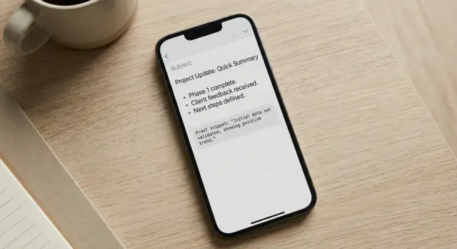
Example: a plain text cold email that looks good on mobile
Scenario: an SDR emails a founder who likely skims on their phone. The goal is a fast read: one clear idea, one proof point, and a simple next step.
Here’s a “before” version that feels dense and easy to ignore:
Subject: Quick question
Hi Jamie, I saw you’re growing fast and thought I’d reach out because we help companies like yours improve outbound and generate more meetings. Our platform has lots of features like domains, warmup, sequences, tracking, and more. If you have time this week I’d love to show you a demo and talk about how we can help you increase revenue. Are you free Tuesday or Wednesday?
Thanks,
Alex
Now the same message, formatted for mobile and built around a small proof block:
Subject: 12 more replies from the same list?

Hi Jamie - quick note.

Not sure if outbound is on your plate right now, but I noticed you're hiring for sales.

Proof:
- +18% reply rate in 14 days for a B2B SaaS team (after fixing deliverability + copy)

If helpful, I can share 2-3 ideas based on what you're selling:
- tighten the first 2 lines so it reads well on mobile
- add a simple proof block (1 metric, 1 client type)
- keep the CTA to a yes/no question

Would you prefer:
A) I send a 5-line rewrite you can copy/paste, or
B) I send a 3-step checklist your SDRs can follow?

Alex
Notice what changed: shorter lines, more white space, and the proof is isolated so it stands out while scrolling. The final question gives two choices, which is easier to answer than “Want a demo?”
Next steps: make your formatting repeatable
Once you find a plain text layout that reads well on a phone, make it the default.
Start with a small set of reusable templates your whole team can use. Name them by intent, not persona:
- Quick intro + 1 proof line + 1 question
- Problem-first + short bullets + CTA
- Referral style + proof block + two time options
Then standardize the proof block so it always looks the same. Pick one pattern and reuse it. When proof is consistent, you can change the offer without rewriting your format every time.
A practical example: if your proof block always starts with “Proof:” and ends with a single metric, your team stops improvising labels like “FYI” or “Just so you know,” which makes testing messy.
Test structure changes, not just subject lines. You can learn a lot by changing one formatting element at a time:
- One question vs two questions
- Bullets vs one tight paragraph
- Proof above the ask vs proof below
- 2 short paragraphs vs 3 even shorter ones
If you use LeadTrain, you can turn your best templates into multi-step sequences, run A/B tests on body structure, and keep replies categorized automatically (interested, not interested, out-of-office, bounce, unsubscribe). That makes it easier to spot which formatting gets the fastest replies.
Document what wins. Keep a simple note: template name, proof used, what you changed, and what happened. Over time, plain text email formatting becomes a repeatable system, not a guessing game.
FAQ
Why does plain text formatting matter so much on mobile?
Most cold emails are opened on phones, where long lines wrap awkwardly and big paragraphs feel like work. Plain text with clean spacing looks personal and easy to scan, which makes replying feel low-effort.
How short should my paragraphs be for mobile readers?
Keep each paragraph to one idea and usually one or two sentences. If a paragraph would turn into more than about three or four lines on a phone, split it so the reader doesn’t lose the thread.
What should be in the first 2–3 lines of a cold email?
Put your “why you” and the core point in the first two or three lines, before any background. If someone only reads the first screen, they should still understand what you want and why it’s relevant.
How do I show proof in plain text without sounding like I’m bragging?
Use a single proof line right before the ask, and make it specific with a number, timeframe, and who it was for. Proof should support your question, not take over the email.
When should I use bullets in a plain text cold email?
Use bullets only when they save words and make scanning easier, and keep them very short. If you need more than a few bullets, it’s usually better to turn it into one tight sentence instead.
What spacing and separators look natural (and not spammy)?
A single blank line between ideas is the simplest and most “human” separator. Avoid heavy symbol dividers or lots of one-line fragments, because they can feel like a template stitched together.
What’s the best kind of CTA for a mobile-friendly cold email?
End with one clear question that’s easy to answer quickly, ideally yes/no or a simple choice. If you stack multiple asks, most people choose none and move on.
How should I write subject lines that work on mobile?
Keep it short, specific, and readable on a lock screen preview. A subject that hints at the outcome or the question you’re asking usually beats vague lines like “Quick question.”
What formatting mistakes most often hurt replies?
The big ones are walls of text, vague proof, too many asks, and “ad-like” styling such as excessive punctuation or hype. A good fix is to do a phone read-through and cut any line that doesn’t help someone decide in seconds.
How can I A/B test formatting without making my tests messy?
Test one structural change at a time, like proof above vs. below the ask, one question vs. two, or a short proof line vs. a longer explanation. If you change multiple things at once, you won’t know what actually improved replies.