Outbound metrics dashboard: the numbers that drive action
Build an outbound metrics dashboard that highlights list quality, conversations, and pipeline, with clear thresholds and specific actions for each number.
What a useful outbound dashboard actually does
A useful outbound metrics dashboard isn’t a wall of numbers. It’s a decision tool. If a metric doesn’t tell you what to change next, it doesn’t belong on the main view.
Dashboards fail when they try to track everything: every open-rate slice, every mailbox, every tiny daily swing. More metrics usually means less clarity. The result is status reporting instead of action.
Keep the dashboard anchored to three outcomes outbound can actually improve:
- List quality: Are you reaching real, relevant people at valid addresses?
- Conversations: Are prospects engaging with your message in a meaningful way?
- Pipeline: Are those conversations turning into meetings and revenue?
“Good” is mostly about trends, not one-day spikes. A single bad day can be a provider hiccup or one risky batch of leads. A two-week slide is a signal. Pick a steady window (often weekly) and compare it to your own baseline, not a random benchmark.
The dashboard becomes useful when every metric has a matching action. If you can’t answer “what do we do if this goes up or down?”, it’s noise.
Set goals, time windows, and baselines first
Start by deciding what decisions the outbound metrics dashboard should support. For most teams, it’s a short list: deliverability, list quality, reply quality, meeting creation, and pipeline.
Then lock in a time window and stick to it. Weekly totals are easy to review, but they can hide sudden issues. A rolling 7-day view catches shifts faster without overreacting to a single bad day. Many teams use both: a weekly review with a rolling 7-day safety check.
Before you change copy, subject lines, volume, or lead sources, establish a baseline. Run the same setup long enough to see a normal range (not a single number) for your team. Otherwise you’ll credit the wrong change, or panic over normal noise.
Make ownership explicit even if the dashboard is shared. Someone should watch deliverability signals frequently, and someone should own weekly message and list performance.
Cold email deliverability metrics to watch every week
A good outbound metrics dashboard starts with one question: are your emails reaching real inboxes? If deliverability slips, every other metric gets noisy.
Focus on four signals that move early. Review them weekly by mailbox and domain, not just in total, because small problems hide inside averages.
- Bounce rate (hard vs soft): Rising hard bounces usually mean bad addresses or rejection. Rising soft bounces often point to temporary limits, volume spikes, or reputation pressure.
- Spam complaints: Even a tiny number is a loud warning. If complaints show up, stop scaling volume and look at targeting and copy.
- Unsubscribe rate: Unsubs are normal, but a sudden jump usually means the list is off, the offer is unclear, or the first email feels too pushy.
- Open rate (use carefully): Privacy tools can block or inflate opens. Treat opens as a drop detector, not as truth.
If you want a few practical inbox-placement proxies without complex testing, watch how fast replies arrive and whether reply behavior changes by provider. When time-to-first-reply gets slower across multiple sequences, or replies vanish for one provider while others stay stable, treat it like a deliverability investigation.
What to do when deliverability dips
When deliverability drops, don’t guess. Find what changed, isolate where it’s happening, then take the smallest action that stops the damage.
Start with basics that break quietly:
- Confirm SPF, DKIM, and DMARC are passing for the exact sending domain.
- Check sending volume per mailbox (today vs last 7-14 days).
- Look for new domains or mailboxes that started sending too soon.
- Review bounce and complaint spikes, even small ones.
Next, look at warm-up and volume changes. Sudden jumps backfire because inbox providers read them as risky behavior. If you ramped up too fast, roll back to the previous safe volume and increase again gradually.
Finally, segment the view so you can find the culprit instead of punishing everything. Break metrics down by sending domain, mailbox, and campaign. Often only one mailbox is getting flagged, or one campaign is causing bounces because the list source changed.
When you find the problem, take the direct action:
- Pause the worst-performing campaign (high bounces or complaints).
- Slow down sending for the affected domain or mailbox for 3-7 days.
- Fix authentication immediately, then recheck.
- Clean the exact list segment that triggered the dip.
Example: if Gmail replies vanish but Outlook is fine, focus on the domain and mailbox mix used for Gmail targets, not your whole program.
List quality KPIs that predict reply quality
A lot of “message problems” are really list problems. If your outbound metrics dashboard shows shaky list quality, replies skew toward bounces, out-of-office, and “not interested”, even with good copy.
Start with data validity checks. Track how often key fields are missing or suspicious: company name, website, industry, seniority, and job title. Also watch staleness signals, like people whose titles no longer match the company or companies that changed domains.
Then track risk flags that predict low-value conversations. Catch-all domains can inflate delivered volume while hiding bad addresses. Role accounts (info@, sales@) and free email addresses often reply less, and when they do, it’s rarely a buying conversation.
A few list quality KPIs are worth putting on the dashboard because each one has a clear fix:
- Required field coverage (%): If it dips, re-enrich and block sending until it recovers.
- Title match rate (%): If low, tighten filters and update persona keywords.
- Catch-all rate (%): If high, reduce catch-all sourcing or send smaller test batches first.
- Role/free-email rate (%): If rising, add exclusions and refresh the source.
- Duplicate/overlap rate (%): If high, dedupe and prevent people from entering multiple sequences.
If you pull prospects from an API provider like Apollo, a list can look big while hiding old titles and catch-all domains. The fix usually isn’t more volume. It’s a refresh: re-enrich the same segment, tighten title rules, and replace the noisiest sources.
Conversation metrics that show if your message works
Conversation metrics answer one question: when someone reads your email, do they respond in a way that moves you forward?
Reply rate tells you whether the email gets a reaction. Positive reply rate tells you whether the offer and targeting are right. If reply rate is fine but positive replies are low, your message is getting attention for the wrong reason.
Keep the set small and outcome-based:
- Reply rate (all replies / delivered)
- Positive reply rate (interested / delivered)
- Not interested rate (not interested / delivered)
- Unsubscribe rate (unsubscribe / delivered)
- Out-of-office rate (OOO / delivered)
Time-to-first-reply is a simple reality check on follow-ups. If most positive replies arrive after the first follow-up, stopping at one email leaves meetings on the table. If most replies arrive within 24 hours and later follow-ups mostly add unsubscribes, you’re pushing too hard.
Use these metrics to trigger specific changes:
- High replies, low positives: tighten targeting and rewrite the offer.
- High not interested: adjust positioning and add a clear disqualifier line.
- Rising unsubscribes: reduce follow-up count or soften tone and frequency.
- Lots of OOO: shift sending days or improve time zone targeting.
Pipeline metrics that prove outbound impact
If your dashboard stops at opens and replies, it’s easy to celebrate activity without proving results. A useful outbound metrics dashboard connects outreach to sales outcomes, using the same stages your CRM uses.
First, define what counts as outbound-sourced (for example, first touch was a cold email sequence). Then track a simple flow: meeting booked, qualified meeting, opportunity created, closed won.
The pipeline metrics that change decisions are usually these:
- Outbound-sourced meetings booked: If flat, adjust the call to action before rewriting everything.
- Qualified meeting rate: If bookings are high but qualification is low, tighten targeting and add one pre-qualifying line.
- Opportunity creation rate: If it drops, the handoff is often the issue. Fix what context the SDR passes and confirm next steps in the meeting.
- Stage conversion rates (reply to meeting, meeting to opp): Improve the bottleneck step instead of chasing every metric at once.
- Sales cycle time and stage drop-off: If deals stall after the first call, your email may overpromise or discovery needs work.
Example: you book 40 meetings in a month, but only 10 are qualified and 2 become opportunities. That’s not a volume problem. It points to weak list selection or a too-broad promise. The fastest fix is usually narrowing the audience, tightening the CTA to pre-qualify, and agreeing on an SDR-to-AE handoff checklist.
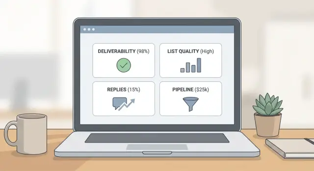
Step by step: build the dashboard in one afternoon
A good outbound metrics dashboard fits on one page and answers one question fast: what should we do next?
Start with four blocks, each limited to a handful of numbers:
- Deliverability: bounces, spam complaints, unsubscribes, plus a simple reply-speed signal.
- List: required-field coverage, title match, risk flags (catch-all/role/free), duplicates.
- Conversations: reply rate, positive reply rate, unsubscribe rate, OOO rate.
- Pipeline: meetings booked, qualified meetings, opportunities created, stage conversion.
Add filters that match how you work: date range, campaign, segment (persona/industry/region), mailbox or domain, lead source, and owner. Filters turn one dashboard into multiple useful views without extra reports.
Then set thresholds and write the action right under the number. Color coding only helps when it triggers a decision. Keep the language plain, like “pause this campaign and clean this segment” or “reduce volume for this mailbox for 5 days.”
Common traps that make dashboards misleading
One classic trap is chasing open rate. Opens can be blocked, inflated, or undercounted, and they rarely explain why meetings dropped. If bounces or complaints rise, inbox placement is probably getting worse even if opens look fine.
Another trap is blending different audiences into one view. A tight segment of mid-market founders behaves differently than a broad enterprise operations list. When you average them together, you hide the problem and fix nothing.
The patterns that create misleading “green” dashboards are consistent:
- Watching opens while bounce, complaint, and unsubscribe signals rise.
- Combining segments so you can’t see which one is failing.
- Changing copy, targeting, and volume in the same week, then guessing what caused results.
- Looking at totals instead of per-mailbox and per-segment trends.
If one mailbox gets blocked, totals can hide it. Per-mailbox trends make the fix obvious.
A weekly review that actually leads to changes
A weekly review only works if you treat it like a habit, not a report. Keep the same day, the same time window (last 7 days), and the same questions.
Start with a quick health check so you don’t judge performance on a broken setup: authentication passing, warm-up steady, no sudden volume jumps, bounces and complaints not rising, replies being captured and categorized consistently.
Then do a list sanity check before blaming the copy. A small random sample is often enough to spot bad sources: duplicates, role accounts, obvious persona mismatches, missing names, and heavy catch-all patterns.
Finish the meeting with decisions you can assign:
- The top issues (deliverability, list, messaging)
- The actions tied to each issue
- Owner and due date
- One test for next week (subject, first line, offer, list slice)
If you can’t assign owners and dates, you’re observing, not operating.
Example: diagnosing a bad week and fixing it
Monday looks great on volume. You swapped to a new list source and doubled sends. By Friday, meetings are down and your inbox is full of low-quality replies: “wrong person,” “not our industry,” and more unsubscribes than usual.
Your outbound metrics dashboard should make the first split clear: list problem or message problem?
If deliverability is steady (bounces and complaints are flat) but list-quality KPIs deteriorate, the biggest change is who you reached, not whether the emails landed.
Week 1 actions that stop the bleed without killing learning:
- Pause the new source for 48 hours and keep the old source running as a control.
- Segment reporting by source so every metric can be compared side by side.
- Tighten targeting (titles, company size, location) and remove broad filters.
- Add a pre-check: sample 50 leads and verify role fit before uploading.
- Update the first line so it speaks to the exact role and use case.
Week 2, look for proof. If the message was the issue, you’ll see improvement across both sources. If the list was the issue, only the cleaned segment improves.
To report this simply, compare old source vs new source on delivered, positive replies, meetings, and cost per meeting. Skip opens and total replies.
Next steps: make the dashboard part of your operating rhythm
Keep your outbound metrics dashboard small and stable. Pick 8-12 metrics, lock definitions for a month, and avoid changing multiple variables at once. Consistency is what makes trends real.
If you want fewer handoffs and less tool-juggling, LeadTrain (leadtrain.app) is built to keep domains, mailboxes, warm-up, multi-step sequences, and reply classification together, which makes it easier to connect deliverability signals to conversations and pipeline.
End every weekly review with one clear outcome: what you’ll change next week (list source, targeting, offer, copy, send volume), who owns it, and what metric should move if it worked.
FAQ
What metrics should an outbound dashboard include at minimum?
Start with the decisions you need to make each week, then include only the metrics that change those decisions. A practical default is four blocks: deliverability, list quality, conversation quality, and pipeline outcomes.
Should I track metrics daily, weekly, or rolling 7 days?
Use a stable review window first, then add a faster safety check. A good default is weekly totals for decision-making plus a rolling 7-day view to catch sudden deliverability or list shifts without overreacting to a single day.
Why is open rate a weak main dashboard metric for cold email?
Because they often don’t tell you what to do next. Treat opens as a drop detector, not a success metric, and prioritize bounces, spam complaints, unsubscribes, reply quality, and meetings booked.
What’s the first thing to do when deliverability suddenly dips?
Stop scaling volume and isolate the issue by domain, mailbox, and campaign. Check that SPF, DKIM, and DMARC are passing, roll back to the last safe send volume for a few days, and pause any campaign or list segment causing bounce or complaint spikes.
How do I use hard vs soft bounce rate to decide what to change?
They point to different fixes. Hard bounces usually mean invalid or rejected addresses and should trigger list cleanup and tighter sourcing; soft bounces often mean temporary limits or reputation pressure and should trigger a slower send rate and smoother ramp-up.
Which list quality KPIs actually predict better replies?
Start by tracking required field coverage and title/persona match, because missing or mismatched data usually creates low-quality replies. Then watch catch-all, role accounts, free email share, and duplicates, since each one predicts wasted sends and has a clear exclusion or testing action.
What does “high reply rate but low positive reply rate” usually mean?
It’s usually a targeting or offer problem, not a deliverability win. Tighten the audience, rewrite the offer to be more specific, and add a simple disqualifier line so the wrong people opt out instead of replying negatively.
How can time-to-first-reply help me tune follow-ups?
Compare when positive replies arrive versus unsubscribes and “not interested” replies. If positives come after follow-ups, keep the sequence length but adjust timing; if later steps mostly add unsubscribes, reduce follow-up count and soften the tone or frequency.
What pipeline numbers prove outbound is working (beyond replies)?
Track a simple flow tied to your CRM stages: outbound-sourced meetings booked, qualified meeting rate, opportunities created, and stage conversions. If meetings are high but qualification is low, narrow targeting and pre-qualify in the CTA; if opportunity creation is low, fix the handoff context and next steps.
How does an all-in-one platform like LeadTrain help with dashboard accuracy and action?
It helps most when it reduces tool-juggling and makes trends visible by mailbox, domain, campaign, and lead source. For example, an all-in-one platform like LeadTrain can centralize domains, mailboxes, warm-up, sequences, and AI reply classification so you can spot where a drop started and act quickly without stitching reports together.