Micro-landing pages for cold outreach: when they convert
Micro-landing pages for cold outreach can lift replies when prospects need quick proof. Learn when to use one, what to include, and how to keep it fast and credible.
Why cold prospects hesitate to click or reply
Cold emails usually fail because of doubt, not because the writing is terrible. A stranger is asking for time, attention, or a small risk (a call, a signup, even a click). If anything feels unclear, most people pick the safest option: do nothing.
In the first 30 seconds, prospects try to answer a few quiet questions: Is this real? Is this meant for me? What happens if I engage? They also look for signals that you understand their world, not just their job title.
Most people do a fast mental checklist before they click or reply. They want to know who you are, what you’re offering (in one sentence), whether it’s personal or a mass blast, and what the next step looks like. They also want to avoid getting spammed, pulled into a high-pressure sales call, or added to a list.
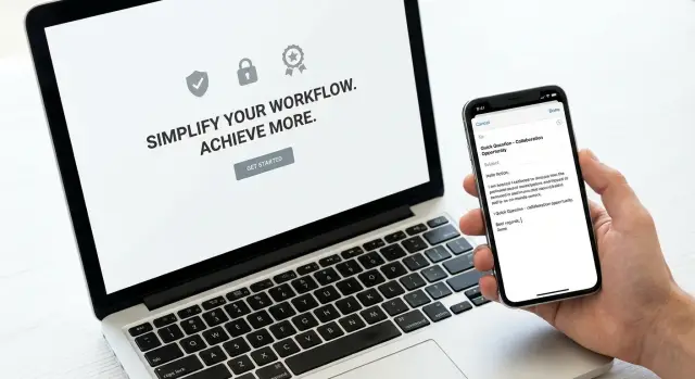
That’s where a micro-landing page can help. A single-page offer page reduces uncertainty without asking for a big commitment. Done well, it answers the “wait, what is this?” questions in plain language, then lets the reader go back to the email and reply with confidence.
The key is keeping it lightweight. If the page is long, slow, or full of hype, it adds friction and makes the email feel less trustworthy. If it’s short, specific, and easy to scan, it acts like a proof card: a quick way to confirm you’re real and the offer is simple.
In a cold outreach flow, the page isn’t the main event. It’s a support tool. Use it when your offer needs a little more context than an email can carry, but not so much that you need a full website.
When a micro-landing page actually helps conversion
A micro-landing page helps when your prospect needs one more step of clarity before they’ll reply. The goal isn’t to “sell online.” It’s to make the next action feel safe and obvious.
It works best when the offer benefits from a quick visual or proof that’s hard to fit into an email: a before-and-after screenshot, a simple 3-step diagram, a short sample report, or two lines of results with a specific timeframe.
It also helps when “book a call” is too big as a first step. If you’re contacting someone who doesn’t know you, asking for 15 to 30 minutes can feel risky. A single-page offer page can offer a smaller first move, like “reply with YES for a sample” or “send me your current setup and I’ll suggest 3 fixes.”
A simple way to decide email vs. page:
- If they can understand the offer and reply in under 10 seconds, keep it in the email.
- If they’ll ask “what do you mean?” or “is this legit?”, use a page.
- If trust is already high (warm intro, known brand, existing users), a page often adds friction.
- If your offer is complex (pricing tiers, multiple outcomes), simplify the offer first instead of adding a page.
Example: you offer “deliverability fixes for outbound teams.” In an email, that can sound vague. A micro page can show the 5 checks you run, one short result, and a clear next step.
What a good micro-landing page looks like
A good micro-landing page is a one-screen idea: one clear promise and one clear next step. If someone clicks from a cold email, they should understand what you do in 5 seconds and know what to do next without hunting.
Start with a specific audience and problem, not a broad claim. “We help SaaS teams grow” is vague. “We set up deliverable cold email domains and warm-up so SDRs can start sending safely this week” is concrete.
A layout that usually works
Keep it skimmable on mobile, with short lines and breathing room. A simple structure:
- A headline that states the outcome and who it’s for (no hype)
- 2 to 3 bullets on what you do and what’s included
- A small proof block that matches the promise
- One call to action (one button or one field, not five)
After the first scroll, the rest should be “details for people who want them,” not a long pitch. One short FAQ can remove friction around timeline, what happens after booking, or what you need from them.
Credible and lightweight
Cut distractions. Skip nav menus, multiple offers, autoplay video, and anything that feels like a trap.
If you mention tools or process, keep it grounded. “Domain + DNS authentication + warm-up + sequence setup” sounds believable. “Instant meetings overnight” does not.
A simple example: an SDR sends a cold email offering a 15-minute deliverability audit. The page repeats that exact offer, shows a 3-step checklist, includes one proof line, and ends with a single “Book the audit” action.
Step-by-step: build a micro-landing page in under a day
A micro-landing page works when it has one job. If you try to sell, explain, and capture every detail, it turns into a full website and people bounce.
Here’s a build order that fits in one workday:
- Choose one action and make everything point to it (book a call, reply by email, request a quote, download a one-pager).
- Write the offer in one plain sentence. Example: “We help Shopify brands cut returns by spotting sizing issues in 7 days.”
- Draft the page around that sentence: headline, 2 to 3 lines on who it’s for, and one proof element.
- Add a minimal form or button. Ask only what you truly need for the next step.
- Publish it on a domain that matches your sending identity so it feels consistent when someone clicks.
Before you send traffic, decide what “working” means and track only the basics: page views, primary CTA clicks, and conversions (form submits or booked meetings).
If you run A/B tests, keep the layout the same and change only one thing (headline or proof block is usually enough).
The only page sections most offers need
A micro page works best when it confirms what your cold email already promised. If the email says “I can book you 8 qualified demos in 30 days,” the page shouldn’t suddenly switch to “full-funnel growth.” Consistency earns the click and the reply.
Most offers only need five parts, in this order:
- A headline that repeats the email promise using the same words
- Three tight bullets: who it’s for, what you do, and the before-and-after change
- One clear call to action with outcome-based button text
- A short FAQ (max 3 questions) addressing the biggest objections
- One “real person” proof point (company name, contact email, or a simple way to verify you exist)
The FAQ is where you prevent unnecessary back-and-forth. Most objections boil down to time, cost, and “how do I know this isn’t spam?” Answer plainly.
If you’re offering to set up cold email infrastructure, your bullets might say it’s for founders doing outbound, you handle domain and mailbox setup, and the outcome is better inbox placement and fewer bounces.
How to keep it credible without looking salesy
Cold prospects do a quick safety check before they reply. They want to know: is this real, is it relevant, and will I regret engaging? A credible micro-landing page answers those questions in plain language, without hype.
Make your claims specific and testable. Instead of “we boost pipeline,” say what you deliver, how long it takes, and what the buyer gets at the end. Example: “We audit your outbound emails in 48 hours and return a 10-point fix list plus two rewritten sequences.” Concrete beats big.
Proof helps, but only when it’s believable. One blurred screenshot, a short quote with a name and role, or a small set of real numbers is enough. If you use logos, only use companies you can truthfully reference, and keep them subtle.
The page should also match the person who sent the email. Add a short blurb that mirrors the sender name and signature, with one clear sentence about what you do and who it’s for. If the email is from “Sam, SDR,” the page shouldn’t read like a faceless brand.
A quick credibility checklist:
- Remove popups, chat ambushes, autoplay video, and countdown timers
- Keep forms short (or offer a reply-first option)
- Use one calm call to action with a clear next step
- If you collect data, add a plain privacy note (what you collect and why)
- Put contact basics where people expect them (name, email, time zone)
Lightweight delivery: speed, domain, and trust basics
A cold prospect decides in seconds if your page feels safe. If it loads slowly, looks different from your email, or sits on a random domain, you add friction before they even read the offer.
Start with the domain. The safest pattern is to keep your sending domain and your page domain closely related (same root domain or a clear subdomain). When someone sees your signature and then lands on a matching domain, it reduces the “who is this?” feeling.
Branding should line up with your email signature. If your email is plain and helpful, but the page screams “marketing,” people get suspicious and bounce.
Speed matters. Keep the page simple, avoid heavy trackers, and skip big libraries unless you truly need them. Also avoid redirect chains. One click should go straight to the page.
Trust basics are simple but non-negotiable: use HTTPS, keep the URL clean, and make it easy to verify who you are.
Mobile-first matters because many prospects read email on their phone. Make sure the key message and the CTA are visible without hunting.
What to measure so you know it’s working
A micro-landing page is only helpful if it improves the outcome you actually want (usually replies and meetings), not just clicks. The easiest mistake is celebrating higher click-through while your reply rate quietly drops.
Track the chain from email to meeting so you can see where people fall off: opens and clicks, page visits, CTA clicks, replies (including unsubscribes), and meetings booked.
If you want a clean test, compare two versions of the same campaign: one asks directly for the meeting in the email, the other asks them to view the single-page offer page first. Keep everything else the same.
Also segment results. A page can help one persona (a cautious ops lead who wants proof) and hurt another (a busy founder who prefers a fast yes/no).
Define a stop rule before you start. If “page-first” increases clicks but lowers replies or meetings after a set number of sends, pause it and go back to the direct ask.
Example: a simple offer page that supports a cold email
An SDR targets operations leaders at mid-sized logistics firms with a focused offer: a 14-day pilot to reduce missed delivery updates using a simple workflow and one integration.
The cold email stays light. It gives one clear benefit, asks one question, and uses a single link to a proof page.
Example email copy:
“Hi Maya - we help logistics teams cut ‘where is my order’ tickets by 20-35% in 14 days. Worth a quick look to see how it works for teams like yours? [Proof page]”
The page should feel like a receipt, not a brochure. Keep it short enough that someone can scan it in 20 seconds and decide whether to reply.
A structure that often works:
- Headline that matches the email promise (same words, same outcome)
- Three bullets explaining what the pilot includes (what you do, what they do, timeline)
- One short case result (1 to 2 sentences with a specific number)
- A single call to action: “Book a 15-minute fit check” (optional secondary: “Reply with 1 question”)
- Trust basics in the footer: company name, contact email, where you operate
Case result example:
“In week two, a regional carrier reduced status-update tickets by 28% after routing delivery events into their helpdesk and sending proactive SMS updates.”
A follow-up email (2 to 3 days later) can reference what they saw without pressure:
“Quick nudge - if you opened the pilot page, happy to share the exact checklist we use in week 1. Should I send it?”
If clicks are high but meetings are low, the page is getting attention but not earning commitment. Change one thing at a time: tighten the CTA, make the pilot terms clearer, or add one more proof point (not more features).
Common mistakes that hurt reply rates
The fastest way to kill replies is turning a micro-landing page into a mini website. Cold prospects don’t want to “explore.” They want to confirm the offer is real, understand the next step, and get out.
Another reply-killer is asking for too much, too soon. If your email asks for a quick call, but the page asks for a long form (company size, phone, budget, timeline), it feels like a trap. Keep the step small.
Watch for credibility mistakes that look fine but read as empty: vague claims (“10x results”), testimonials with no names, and stock-photo vibes. Specific proof and a clear process beat hype.
Mismatch is common and costly. If your email promises “a 2-minute audit,” but the page talks about a full-service retainer, people stop trusting you. Keep the page aligned with the exact promise and wording.
Before you send traffic, do a quick pass:
- One clear action (reply, book, or request)
- The ask is visible immediately and repeated once
- The page matches the email promise word-for-word
- Proof is specific, not generic
Quick checklist before you send traffic to the page
Before you put a micro-landing page into a cold email, do a final pass for clarity, trust, and basic hygiene. Small issues here can tank clicks and replies.
Focus on five things:
- One audience, one promise, one next step
- Proof that feels real and matches the claim
- Fast and clean on mobile
- Identity matches your email (especially the domain)
- Measurement and a simple test plan
Read the page like a skeptical stranger: “Do I know what this is, who it’s for, and what happens if I click?” If any answer is fuzzy, tighten it.
Next steps: ship one page, test, and scale carefully
Treat your first page like a prototype, not a final website. Pick one campaign, one audience, and one single-page offer page that matches the promise in your email.
Launch it fast, then let real conversations shape the page. Your best copy usually comes from replies: the questions people ask, the objections they raise, and the words they use when they’re interested.
Keep your sending setup healthy so the page actually gets seen. If deliverability slips, your link becomes irrelevant because the email lands in spam or gets filtered.
If you want fewer moving parts, LeadTrain (leadtrain.app) is built to keep outbound basics together: domains, mailboxes, warm-up, multi-step sequences, and reply classification in one place. That makes it easier to run clean tests and see whether the page is improving replies and meetings, not just clicks.
FAQ
When should I add a micro-landing page to a cold email?
Use one when the email can’t answer “what is this?” fast enough. If prospects are likely to wonder whether the offer is real, meant for them, or safe to engage with, a single page that confirms the promise and the next step can lift replies.
What is a micro-landing page supposed to do in cold outreach?
The email gets attention; the page reduces doubt. Its job is to confirm you’re real, restate the offer in plain language, show one believable proof point, and make the next action feel low-risk.
What should a good micro-landing page include?
Keep it to one screen of meaning: a specific headline, a few tight lines on what’s included, one proof element, and one clear next step. If someone can’t understand it in about five seconds, it’s too heavy for cold traffic.
How do I make the page feel credible instead of salesy?
Make it consistent and lightweight. Match the wording from the email, avoid hype, remove distractions, and show something verifiable like a simple checklist, a small result with timeframe, or a clear process that sounds realistic.
What’s the best call to action for cold prospects?
Pick one primary action and design everything around it. Good first steps are small commitments like “reply for a sample,” “request a quick audit,” or “book a short fit check,” rather than a big “schedule a full demo” ask.
How do I keep the page aligned with the cold email?
A mismatch breaks trust fast. Repeat the same promise, audience, and terms from the email, using the same words, and make sure the page doesn’t introduce a different product, broader pitch, or bigger commitment than the email asked for.
Can I really build a micro-landing page in one day?
Start with the goal and the offer sentence, then add only what supports it. Write the headline, add a small proof block, add a minimal form or single button, and publish on a domain that matches your sending identity so it feels consistent.
What technical details matter most for trust and conversion?
Slow load and “random domain” vibes are common killers. Keep it fast, clean, HTTPS, mobile-friendly, and consistent with the sender identity; if it looks like a different company than the email, people hesitate and bounce.
What metrics should I track to know if the page is working?
Don’t judge it by clicks alone. Track the full chain from email to replies and meetings, because a page can increase clicks while reducing replies if it adds friction or makes the ask feel bigger.
What are the most common mistakes that hurt reply rates?
Too many fields, too much text, and vague proof are the usual problems. Another common mistake is turning it into a mini website with multiple offers; cold prospects want quick confirmation and one obvious next step, not something to explore.