Compare pages that win deals with honest differentiation
A practical framework for writing compare pages that stay fair, show real tradeoffs, and turn curious shoppers into calm, high-trust conversations.
Why buyers read compare pages in the first place
A compare page helps someone choose between two options. It answers three questions: what’s the same, what’s different, and who each option is best for.
People read compare pages when they’re close to a decision. They’ve already looked at your homepage, checked pricing, maybe watched a demo. Now they want a reality check before they commit time, budget, and their reputation.
That’s why compare pages matter: the buyer is trying to reduce risk, not get excited. They want to know what could go wrong after purchase, what will be harder than expected, and whether your product fits how they work day to day.
Negative comparison pages backfire because buyers can smell them. Cherry-picked screenshots, quote-mined reviews, and snarky shots at competitors don’t make the competitor look bad. They make you look untrustworthy. And a buyer might forward the page internally. Nobody wants to champion a vendor that sounds petty.
A good compare page has one job: help the right-fit buyer choose confidently, even if the answer isn’t you. That’s how you earn credibility with serious buyers.
In two minutes, most buyers are trying to get:
- The few differences that matter after week one
- Clear tradeoffs, not just benefits
- Specifics (how it works, what’s included, what’s required)
- Who should pick each option
- A sensible next step if they’re unsure
A concrete example: an SDR lead might be comparing an all-in-one outbound platform like LeadTrain to a tool stack (separate domains, warm-up, sequences, and reply sorting). They’re not just comparing features. They’re asking: “Will this cut setup work, keep deliverability safe, and reduce time spent triaging replies?” If your page answers those questions calmly, comparison turns into a conversation, not a fight.
When to create a compare page (and when not to)
Create compare pages when buyers are already doing the comparison without you. If sales calls keep circling the same competitor, or prospects send feature tables, you’re losing control of the story. A clear page lets you answer once, with consistent facts.
Good times to publish usually look like this:
- The same competitor name shows up in demos, emails, or inbound forms
- Deals stall on the same uncertainty (setup time, deliverability, workflow, total cost)
- Sales keeps writing custom comparison notes and they’re inconsistent
Hold off if you’re not ready. A comparison page magnifies whatever is unclear about your product. If your ICP is fuzzy, your pricing is hard to explain, or your differentiators change depending on who you ask, the page will feel like hand-waving. Fix the basics first: who you’re for, what you do best, and where you’re not the best fit.
Also, don’t compare yourself to everyone. Pick one to three comparisons that match how you actually win deals. For example, LeadTrain might benefit more from “all-in-one outbound platform vs a stack of separate tools” than from chasing every single email sequencer on the market.
Choose the right page type
Match the format to the buyer’s question:
- Head-to-head: prospects ask about one specific competitor
- Alternatives page: prospects want options and you want to define the category
- “Best for” page: buyers self-segment (solo founder vs SDR team, simple vs advanced)
If you can’t name the exact buyer question the page answers, don’t publish yet. That’s how you end up writing something that sparks arguments instead of helping someone decide.
The tone that earns trust: calm, specific, and fair
Most people reading a comparison page aren’t looking for a knockout punch. They’re trying to avoid a career-limiting mistake. If your page sounds angry, smug, or vague, it raises the stakes in the wrong way.
Write as if the reader will check your claims in five minutes, because they will. They’ll open review sites, ask peers, and poke at your product. A calm tone signals you expect that scrutiny and can stand behind what you’re saying.
Specific beats persuasive. Instead of “we’re better,” name the exact difference and the tradeoff. “We include built-in warm-up and mailbox setup” is clearer than “We handle deliverability.” If there’s a limit, say it. Fair doesn’t mean generous. It means accurate.
Keep language simple and avoid insider terms. If you have to use one, define it in the same sentence.
A quick tone check before you publish:
- Can a cautious buyer repeat the main points in one minute?
- Do you describe tradeoffs, not just wins?
- Are claims tied to something concrete (a feature, a policy, a number)?
- Would a competitor agree your description of them is mostly accurate?
- Does each sentence help someone decide, not just feel impressed?
One practical trick: replace “best” and “leading” with “best fit when” and finish the sentence. “Best fit when you need an all-in-one outbound setup” reads like guidance, not a fight.
A simple framework: criteria, tradeoffs, and best-fit
Good compare pages don’t try to win with hype. They help a real buyer make a decision that feels safe and sensible.
The 5-part checklist
Start by getting clear on who you’re writing for and what they’re trying to accomplish this week, not “someday.” For example: an SDR lead who needs to launch outbound quickly without breaking deliverability, or a founder who wants fewer tools to manage.
Then use this sequence:
- Name the buyer’s job in plain words (what they want done and what they want to avoid).
- List 5 to 8 decision criteria using the buyer’s language (setup time, deliverability risk, workflows, reporting, pricing predictability).
- For each criterion, answer “Yes,” “No,” or “Depends,” then add one sentence explaining why.
- State the tradeoff and who it fits best (and who should choose the other option).
- End with a next step that matches intent, not pressure.
The “Yes/No/Depends” move forces clarity. “Depends” is fine, but only when you say what it depends on (team size, technical comfort, sending volume, or the need for tenant-isolated infrastructure).
A clean tradeoff line sounds like this: “If you want one place to manage domains, mailboxes, warm-up, and sequences, an all-in-one platform like LeadTrain is usually simpler. If you already have a stack you love and someone to maintain it, separate tools may feel more flexible.”
For the last step, offer one calm option: a quick reply with their use case, a short call, or a trial. Pick the one that matches how ready they are.
Page structure that people actually scan and understand
Most compare pages fail because they read like a memo. Buyers skim. They want a quick answer first, then enough detail to trust it.
Start with a short summary that names the best fit for each option. Two to four sentences is enough. For example: “Option A is best if you want full control and already have a deliverability process. Option B is best if you want speed, fewer tools, and guided setup.” This makes the page useful even if someone only reads the top.
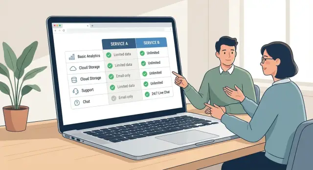
Next, give skimmers something they can scan in 15 seconds: a simple table with consistent categories.
| Criteria | Option A | Option B |
|---|---|---|
| Setup | Who does what, how long | Who does what, how long |
| Deliverability | Auth, warm-up, reputation | Auth, warm-up, reputation |
| Workflows | Sequences, routing, team use | Sequences, routing, team use |
| Reporting | What you can see and export | What you can see and export |
| Support | Onboarding, response times | Onboarding, response times |
After the table, add short paragraphs explaining the “why” behind the differences. Focus on day-to-day reality: what changes in routine, what takes longer, what can break, and what a team needs to manage.
A “What we do differently” block can work well right after that context. Keep it short, and write as outcomes, not slogans:
- Fewer moving parts, less tool switching
- Faster first campaign with guided setup
- Clearer reply handling with less manual sorting
- More consistency across a team
- Built-in deliverability hygiene, less guesswork
Close with a gentle CTA that invites a conversation. “If you tell us your volume, team size, and current stack, we’ll suggest the safer option, even if it’s not us.” If you’re offering an all-in-one platform like LeadTrain, this is also a natural place to offer a quick fit check without pressure.
How to write differentiation without trash-talking
Buyers read compare pages to reduce risk, not to watch a brand win an argument. The fastest way to lose trust is to sound angry, vague, or smug.
Start by replacing adjectives with behaviors. “Better deliverability” is easy to dismiss. “Warm-up runs automatically and ramps sending volume over 14 days” is concrete. Specifics feel calmer because they can be checked.
Swap adjectives for what actually happens
Anchor every point in something observable:
- What the buyer has to do (steps, setup time, ongoing work)
- What’s included vs paid extra (domains, mailboxes, warm-up, analytics)
- How long it takes to get value (same day, a week, a month)
- What breaks at scale (limits, add-ons, admin overhead)
- What support looks like (self-serve, chat, onboarding)
Use language that gives the reader a safe exit. A simple “You might prefer X if…” lowers defenses and often earns more credibility than a punchy claim.
A few phrases that stay honest:
- “Choose X if you already have strong in-house ops for setup and maintenance.”
- “X is a good fit when you only need one feature, not a full workflow.”
- “If you send low volume and hate learning new tools, X may feel simpler.”
Also say who should not pick you. If your product is an all-in-one cold email platform like LeadTrain, be clear that teams who want to hand-pick every tool, or who need deep customization in one narrow area, may prefer a stack.
Keep sentences short and comparisons direct. Drop loaded words like “best,” “worst,” and “leading.” Let the tradeoff do the work.
Claims, proof, and staying on the right side of fairness
A good comparison page is built on verifiable claims. If you can’t prove something quickly, rewrite it as an opinion, a tradeoff, or a “best for” statement.
Start with pricing. Most “X is cheaper than Y” claims fall apart because bundles differ. Before you put numbers side by side, spell out what’s included: number of mailboxes, warm-up, sending domains, reply handling, and any add-ons. If LeadTrain includes domains, mailbox warm-up, multi-step sequences, and AI reply classification in one place, say that plainly, then compare it to the cost of assembling those pieces elsewhere.
Deliverability is even trickier. Avoid guarantees like “always hits inbox” or “best deliverability.” Talk about practices and controls you actually provide, such as automatic SPF/DKIM/DMARC setup, gradual warm-up, and tenant-isolated sending infrastructure where each org keeps its own reputation.
When you use proof, keep it clean:
- Use screenshots only if they’re current, dated, and labeled (plan, screen, time period).
- Quote competitor wording carefully and sparingly.
- Use trademarks only when needed to identify the product.
Add a simple “Last reviewed” note. Buyers know products change. A visible date plus a lightweight update habit (check pricing pages, re-verify key claims, refresh screenshots) signals honesty and protects your credibility when sales shares the page.
Common mistakes that turn compare pages into a fight
Compare pages backfire when they try to “win” by talking past what buyers care about. People open a comparison because they want clarity, not a debate.
One common trap is vague hype. Words like “easy,” “powerful,” or “all-in-one” sound safe, but they raise suspicion without specifics. Replace them with details a buyer can picture: setup time, what’s included (domains, mailboxes, warm-up, sequences), and what work still sits on the customer.
Another fight-starter is cherry-picking edge cases. If you only compare the one feature you excel at, buyers assume you’re hiding the rest. Anchor your points to everyday workflows: getting started, staying deliverable, managing replies, and reporting.
Pricing comparisons can also feel unfair. If you compare your premium tier to their entry tier (or the other way around), you may “win” the table but lose trust on the call. Match plans by real usage: seats, sending limits, and the features needed to run the workflow.
Big tables look impressive and still fail. Once you pass a small number of rows, readers stop scanning and start doubting.
Signs your page is turning into a fight:
- The table keeps growing, but the decision is still unclear
- You avoid naming tradeoffs (and buyers learn them elsewhere)
- You use loaded words like “bad,” “broken,” or “outdated”
- You compare features that don’t matter in normal use
- You treat every difference as a win
The most damaging mistake is hiding tradeoffs. If there’s a downside, say it plainly and explain who it affects. For example, an all-in-one outbound platform like LeadTrain may suit teams that want domains, warm-up, sequences, and reply classification in one place. A tool stack can fit teams that need deep customization and already have admin time to maintain it. That kind of honesty lowers defenses and keeps the conversation real.
Quick checklist before you publish
Before you hit publish, read the page like a buyer with five tabs open and zero patience. The goal isn’t to win. It’s to help someone self-select quickly, then give them a comfortable way to move forward.
On the first screen, a reader should know who each option fits. If they can’t answer “Which one is for me?” in about 10 seconds, the rest won’t land.
A fast pre-publish check:
- Open with a plain best-fit summary for both sides, then back it up with details.
- Sanity-check your criteria against real questions from calls and emails.
- Audit every claim: can sales defend it with a demo, a screenshot, or a policy?
- Read it as if a competitor will share it publicly. If anything sounds snarky or vague, rewrite it.
- Make tradeoffs explicit: “If you need X, choose us; if you need Y, you may prefer them.”
Do one last fairness pass out loud. If you wouldn’t say the sentence on a recorded call, it doesn’t belong on the page.
Add two clear next steps so both high-intent and low-intent readers have an option. One should be direct (request a demo, book a call, start a trial). The other should be lighter (email a question, see a sample workflow). If you’re selling something like LeadTrain, this is also a good place to offer a quick “show me my setup” call for teams weighing an all-in-one platform versus a tool stack.
Example: comparing an all-in-one outbound platform vs a tool stack
An SDR is researching outbound tools and ends up on your compare pages. They’re not asking “Who is better?” They’re asking “Which setup will help me ship this quarter without breaking deliverability or my calendar?”
Here’s a fair way to compare a unified outbound platform (like LeadTrain) against a multi-tool stack (domains provider + DNS help + warm-up tool + sequencer + inbox/reply tool).
Criteria buyers actually care about
Keep it grounded in day-to-day outcomes:
- Time to launch: from purchase to first sequence
- DNS and authentication: SPF/DKIM/DMARC setup effort and risk
- Warm-up: how fast you can build sending reputation safely
- Sequences: multi-step outreach, A/B tests, iteration speed
- Reply handling: how quickly you can sort interest vs noise
Then state the tradeoff plainly. A tool stack can offer more choice and deeper features in each category, but it adds logins, setup, and more chances for something to break (or for tracking and replies to get messy). An all-in-one option is usually faster to set up and easier to run, but you accept its workflow and feature boundaries.
“Best for” summaries (no dunking)
All-in-one outbound platform: best for teams that want to launch fast, keep deliverability basics handled, and reduce switching between tools when running sequences and handling replies.
Tool stack: best for teams that already have strong ops support, enjoy configuring every part, or need a very specific best-in-class tool in one area.
End with an invitation, not a verdict: “If you tell us your volume, target accounts, and how many mailboxes you plan to run, we can suggest the safer setup and what you’d need to do in week one.”
Next steps: ship, share with sales, and keep it updated
Publish when it’s good enough to be useful, not when it’s perfect. A clear, fair draft helps deals now, and you can improve it as you learn what buyers ask.
Turn it into a sales aid, not just a marketing page. Give your team a few ready-to-use pieces they can reuse in emails and calls: a short talk track, a one-paragraph follow-up summary, and a handful of approved snippets that explain tradeoffs without jabs.
Use the page to qualify, not to argue. In discovery, ask which criteria matter most (price, setup time, control, deliverability, reporting, support), then walk through only those sections. If their top criteria point away from you, say so early. That honesty often keeps the conversation open.
If you sell outbound tools, offer a next step that matches how teams actually evaluate: run a small end-to-end test. Set up domains and authentication, warm up mailboxes, launch a short multi-step sequence, then see how replies get handled. Doing that in one place, like LeadTrain (leadtrain.app), makes it easier to judge the workflow without guessing what broke across a stack.
Keep it current. Assign ownership (often product marketing plus a sales lead) and set a simple cadence: monthly updates for screenshots and pricing notes, quarterly reviews using win-loss notes, and an ongoing feedback prompt like “What did we miss that would change your decision?”
FAQ
What is a compare page actually for?
A compare page is for buyers who are already close to choosing and want to reduce risk. It should quickly explain what’s the same, what’s different, and who each option fits, so they can make a safe decision and defend it internally.
How do I know when it’s worth creating a compare page?
Publish one when the comparison is already happening in your deals, like when prospects keep naming the same competitor or sales keeps writing ad‑hoc comparison notes. If nobody asks for the comparison yet, you’ll usually get better results by clarifying positioning and basics first.
Why do negative comparison pages backfire?
Because it signals insecurity and makes your claims feel less trustworthy. Buyers reading comparisons are looking for calm specifics and clear tradeoffs; snark and cherry-picking can make the reader worry you’re hiding weaknesses.
What should the top of the page say so skimmers get value fast?
Open with a short “best for” summary for both options, then back it up with a small set of decision criteria buyers actually use. If someone only reads the first screen, they should still know which option is safer for their situation.
Which comparison criteria matter most to real buyers?
Aim for 5–8 criteria that reflect day-to-day reality, like setup time, deliverability controls, workflow complexity, reporting, and support. Keep each row concrete by describing what the buyer has to do and what’s included versus what requires extra tools or effort.
When is it okay to say “Depends” in a comparison?
Use it when it forces clarity, not when it dodges the question. If you write “Depends,” immediately state what it depends on (for example: team size, technical comfort, sending volume, or how much ongoing maintenance they can handle).
How can I talk about deliverability without making sketchy promises?
Make every claim observable and easy to verify in a demo or product walkthrough. For deliverability topics, avoid guarantees and focus on specific practices you provide, such as automatic SPF/DKIM/DMARC setup, gradual warm-up, and tenant-isolated sending infrastructure so each organization keeps its own reputation separate.
What’s the fairest way to compare pricing without losing trust?
Compare full workflows, not just sticker prices. Spell out what’s included (like domains, mailboxes, warm-up, sequences, and reply handling) and match plans by real usage, such as seats and sending limits, so the reader can do a fair apples-to-apples check.
How should I compare an all-in-one outbound platform like LeadTrain vs a tool stack?
An all-in-one option is usually best when you want fewer moving parts, faster setup, and one place to manage domains, mailboxes, warm-up, multi-step sequences, and reply sorting. A stack is often best when you already have strong ops support, prefer hand-picking each tool, and can handle ongoing maintenance across multiple systems.
What’s a good CTA for a compare page that doesn’t feel pushy?
End with a low-pressure next step that matches intent, like a quick fit check based on volume, team size, and current setup. The goal is to help the reader choose confidently—even if that means pointing them away when the tradeoffs don’t fit.